Wednesday 3 August 2016

Contemporary artists with postmodern inspired works

There are plenty of contemporary artists today that are still producing postmodern inspired works. One of them that I have chosen to include in my essay for comparison is Alex Trochut. Honoured and named Art Directors Club Young Gun, Alex has worked with an impressive line of clients under his belt such as Nike, Adidas, Rolling Stones, Katy Perry, Esquire UK, BBC, Coca-Cola, British Airways, Pepsi, The GuardianThe New York TimesTime Magazine and many others. Alex is also heavily influenced by famous American graphic designers like Herb Lubalin, Saul Bass, Milton Glaser and Paul Rand. (Butler, 2013) 

Alex's works are hyper realistic, his typography works are usually very liquid and sometimes linear too. (Trochut, 2016) He has also made several binary prints that shows 2 different images when viewed under different lighting situations. Usually the one that can be seen in the dark is sometimes creepier and very hyperrealistic. 


music art binary prints alex trochut
Alex Trochut's binary prints.

2010 Bonaroo Music and Arts Festival artist line up poster by Alex Trochut.

Pepsi advertisement campaign by Alex Trochut


Alex Trochut's design for Alagoas's first album.

Katy Perry's single "Roar" designed by Alex.

The binary prints viewed with light.
Binary prints viewed in the dark.

References

Alex Trochut. (n.d.). KATY PERRY | Alex Trochut. [online] Available at: http://alextrochut.com/project/katy-perry-roar/ [Accessed 3 Aug. 2016].
Giphy.com. (n.d.). Art GIF - Find & Share on GIPHY. [online] Available at: http://giphy.com/gifs/art-binary-prints-sBsjJv0gAKeTC [Accessed 3 Aug. 2016].
Trochut, A. (2016). Works | Alex Trochut. [online] Alex Trochut. Available at: http://alextrochut.com/ [Accessed 3 Aug. 2016].
Trochut, A. (n.d.). BINARY PRINTS | Alex Trochut. [online] Alex Trochut. Available at: http://alextrochut.com/project/binary-prints/ [Accessed 3 Aug. 2016].

Saturday 2 July 2016

Theories

The hyperreality theory by French cultural theorist Jean Baudrillard,was explained in his book Simulations and Simulacra. "Medias represent reality and in doing so change it to make it more visual and fun." (Baudrillard, 1983) The hypothetical inability for a viewer to distinguish reality from fantasy in design – which is known as the term ‘Hyperreality’ in the field of Semiotics (the study of signs and sign processes)

A brief description about hyperreality.
French philosopher Jean-Francois Lyotard criticizes so-called postmodern movements that blend neo- and hyper-realistic themes with ―lyrically abstract of conceptual ones on a single surface‖ because it implies ―everything is equal because everything is easy to consume.‖ Maybe because everything is ―easy to consume‖ by the viewers which are why artists are using this theory in their designs? A visual depiction of an object that is understandable universally would be in more favor by the audience. 

Postmodern artists are always rejecting the notion of clean and minimalist design. They are always experimenting with different mediums and styles. Postmodern artists such as Terry Jones and David Carson often does hyperreality designs that are not visually aesthetically pleasing. 

During the reasearch it was noticed that hyperreality is actually around us like the User Experience and User Interface (UX/UI) designs. Skeuomorphism refers to digital designs designed to look like something real in the physical world. Wooden shelves used in apps for reading e-books, toggle switches for Wi-Fi and Bluetooth designed as light switches, the post it note that you use on your desktop to make quick reminders are great examples of skeuomorphism. Although this has nothing to do with graphic designs but it is a really intresting way to look at how hyperreality works around us.

Skeuomorphic buttons on audio recording app.


References

Broadwater, T. (2013). Semiotic Hyperreality and its Effect on Design – Tim Broadwater. [online] Timbroadwater.com. Available at: http://timbroadwater.com/2013/07/semiotic-hyperreality-and-its-effect-on-design/ [Accessed 2 Jul. 2016].
Garza, D. (2013). Death of skeuomorphism and the future of design | Chapter Three. [online] Chapterthree.com. Available at: https://www.chapterthree.com/blog/death-of-skeuomorphism-and-future-of-design [Accessed 2 Jul. 2016].
Post Modernism? - Visuals. (2011). [Blog] Post Modernism Graphic Styles. Available at: http://postmodernismgraphicstyles.blogspot.my/ [Accessed 28 Jul. 2016].
AllAboutWorldview.org. (n.d.). Postmodern Philosophy. [online] Available at: http://www.allaboutworldview.org/postmodern-philosophy.htm [Accessed 2 Jul. 2016].

Tuesday 28 June 2016

Postmodern Graphic Designs

Postmodernism is the new movement that appeared around the 1970's after the end of modernism. We are considered to still be in the postmodern era as well. Postmodernism emerged when artists started to reject the traditional principles of graphic designs. Artists started to make bold choices in colors and arrangement of texts. Works are no longer designed just to aesthetically please the viewer. It is more about the message behind it. 

Here are some key points about postmodernity that was acquired in class : 
  • Truth is relative
  • Uncertainty
  • Incessant choice
  • Consumerism is all
  • Fragmentation of social life
  • Disillusionment with the idea of progress
  • Globalisation
  • Impact of ICT in social life
  • Unpredictable, no absolutes.
Postmodern society feeds upon itself. Recreating the past, entwining it with the present with some mocking humour. During the postmodern era, Jacques Derrida (Prelectur.stanford.edu, n.d.) 

Postmodernists rejected deconstruction and argue that trying to tell the 'big story' now is impossible. Postmodernists claims that all meaning is now relative and socially constructed such as designing products to the female market. Other than that, Jean Francois Lyotard mentions that "we should focus on playing language games to explore the many narratives that exist." 


You are not yourself poster by Barbara Kruger. The uses of cut up texts with bad kerning and alignment, going against the modernist style of graphic design.

God save the Queen by Sex Pistols, Album cover by James Reid
Anti-patriotic, 
The poster has texture along with quite bold, block coloring, both qualities being characteristics of postmodern design
A very contrasting piece which uses capitalized texts that the legibility is quite low. By unknown artist.


other postmodernism
Minor art movements during the postmodern era.


References

Giphy.com. (n.d.). Other GIF - Find & Share on GIPHY. [online] Available at: http://giphy.com/gifs/other-postmodernism-VGnX7udaWz6Xm [Accessed 28 Jun. 2016].

Hoffman, L. (n.d.). An Overview of Premodernism, Modernism, & Postmodernism. [online] Postmodernpsychology.com. Available at: http://www.postmodernpsychology.com/philosophical_systems/overview.htm [Accessed 28 Jun. 2016].

Prelectur.stanford.edu. (n.d.). Presidential Lectures: Jacques Derrida: Deconstruction. [online] Available at: https://prelectur.stanford.edu/lecturers/derrida/deconstruction.html [Accessed 28 Jun. 2016].

Post Modernism? - Visuals. (2011). [Blog] Post Modernism Graphic Styles. Available at: http://postmodernismgraphicstyles.blogspot.my/ [Accessed 28 Jul. 2016].
The Art Story. (n.d.). Postmodern Art - Modern Art Terms and Concepts. [online] Available at: http://www.theartstory.org/definition-postmodernism.htm [Accessed 28 Jun. 2016].

Type Tasting. (2013). How Punk changed Graphic Design. [online] Available at: https://typetastingnews.com/2013/10/24/how-punk-changed-graphic-design/ [Accessed 28 Jun. 2016].


Friday 24 June 2016

After first consultation


After my first consultation with Ms.Va Nee, It was noted that the subjects that have chosen was not quite related to the question at hand. It was a little off topic instead of just focusing on typography and graphic designs itself. During my research, it was proven that calligraphy is actually a sub-category from typography and the question is focusing more on the uses of typography in graphic designs itself. And so, these interesting materials cannot be used and further research has to be done.


After a brief explanation by Va Nee, it is brought up that it would be better to look for artists from both the Modernism and Postmodernism era and compare both of their works instead. We had to analyze the changes of the use of typography in their designs as well as the layout style, colour choice and their aesthetic views.


References

Quirós, J. (n.d.). Calligraphy is not typography, lettering is not #calligraphy, calligraphy is not a font. Calligraphy is just WRITING. [Blog] Looking for an answer. Available at: http://blog.joanquiros.com/post/124819083900/calligraphy-is-not-typography-lettering-is-not [Accessed 2 Aug. 2016].
Tsui, C. (2015). THE DIFFERENCE BETWEEN CALLIGRAPHY LETTERING AND TYPE (AND WHY IT MATTERS). [Blog] STUDIO CHAVELLI. Available at: http://chavelli.com/blog/the-difference-between-calligraphy-lettering-and-type-and-why-it-matters [Accessed 2 Aug. 2016].

Monday 13 June 2016

First research


The assignment brief was handed out to us. We were instructed to choose 1 question out of the 10 questions provided. Question 6 was chosen which was 'Look at some artists whose works rely heavily on the use of words and lettering. Analyse the changes which happened in typography and its use as a part of modern or contemporary art?'.


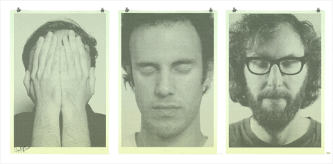
The key words of the question are bolded to simplify the question. Barbara Kruger came to my mind at first because of her works consists of black-and-white photographs overlaid with declarative captions—in white-on-red Futura Bold Oblique or Helvetica Ultra Condensed.


“The Future Belongs to Those Who Can See It”


Untitled (Your body is a battleground)
Graphic artist, print-maker and designer Anthony Burrill is also best known for his typographic, text-based compositions, including the now-famous Work Hard and Be Nice to People. His distinctive voice is lent authenticity by his commitment to traditional image-making processes and materials.


Anthony Burill's famous posters.


I've also leaned onto the art of graffiti as they're writing or drawings that have been scribbled, scratched, or painted illicitly on a wall or other surface, often within public. Some artists uses it as a vehicle to convey their messages using graffiti.


Revolution - Ben Eine

Dream On - Max Rippon a.k.a RIPO


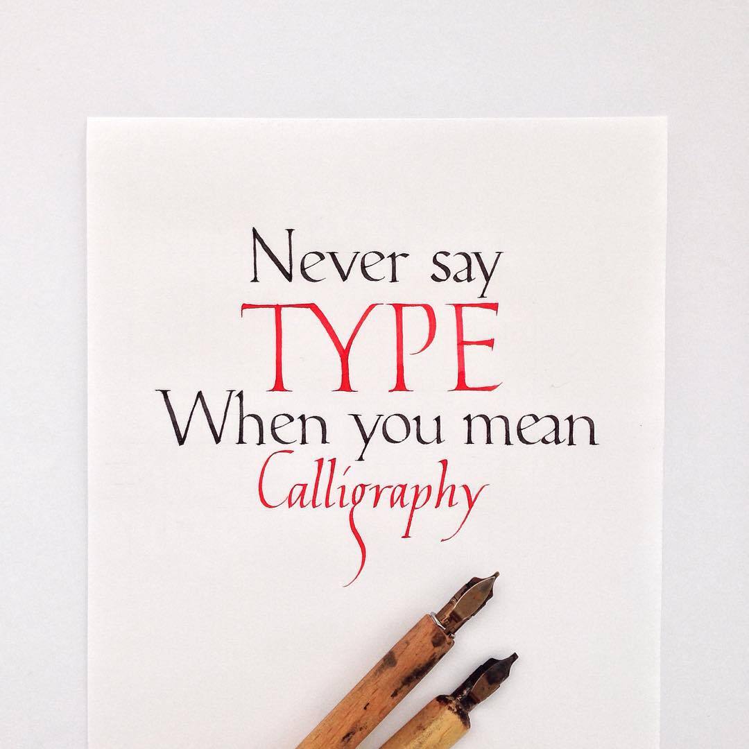
After trying to think of other artists who uses text frequently, I thought of Jake Weidmann. Jake is an artist and master penman who uses words written in calligraphy and turning them into a piece of art.


Semblance by Jake Weidmann
Steward by Jake Weidmann


While researching more on calligraphy the idea of Islamic calligraphy came to me. So I've decided to dig more about it. I've seen modern Islamic calligraphy art being sold in malls. This shows how the ancient art of Islamic calligraphy has evolved with its use as a part of modern or contemporary art. 


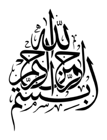
The phrase Bismillah in an 18th-century Islamic calligraphy from
the 
Ottoman region and called Thuluth.


Modern islamic calligraphy art


I have also explored calligraphy of different languages and came upon Ahn sang-Soo. A Korean artist who transform simple Hangul alphabets into an artform.


Ahn Sang-Soo's works deconstructing hangul letters.
  

Another work by Ahn Sang-Soo, deconstructing Hangul
letters that is related to the picture in the background.

The reason of this findings was to compare the changes from traditional calligraphy to 
modernity. I wanted to find out can typography be revolutionized in designs. The theories
that I've chosen to support my findings are Gestalt's theory in typography and design principles . The term Gestalt means 'unified whole', which is a good way of describing the over-arching theme behind the principles: "if you collect together your design elements in an arrangement using one of the approaches, your design will fell more connected, coherent and complete."